Synchronicity I 2014 S
8 minutes
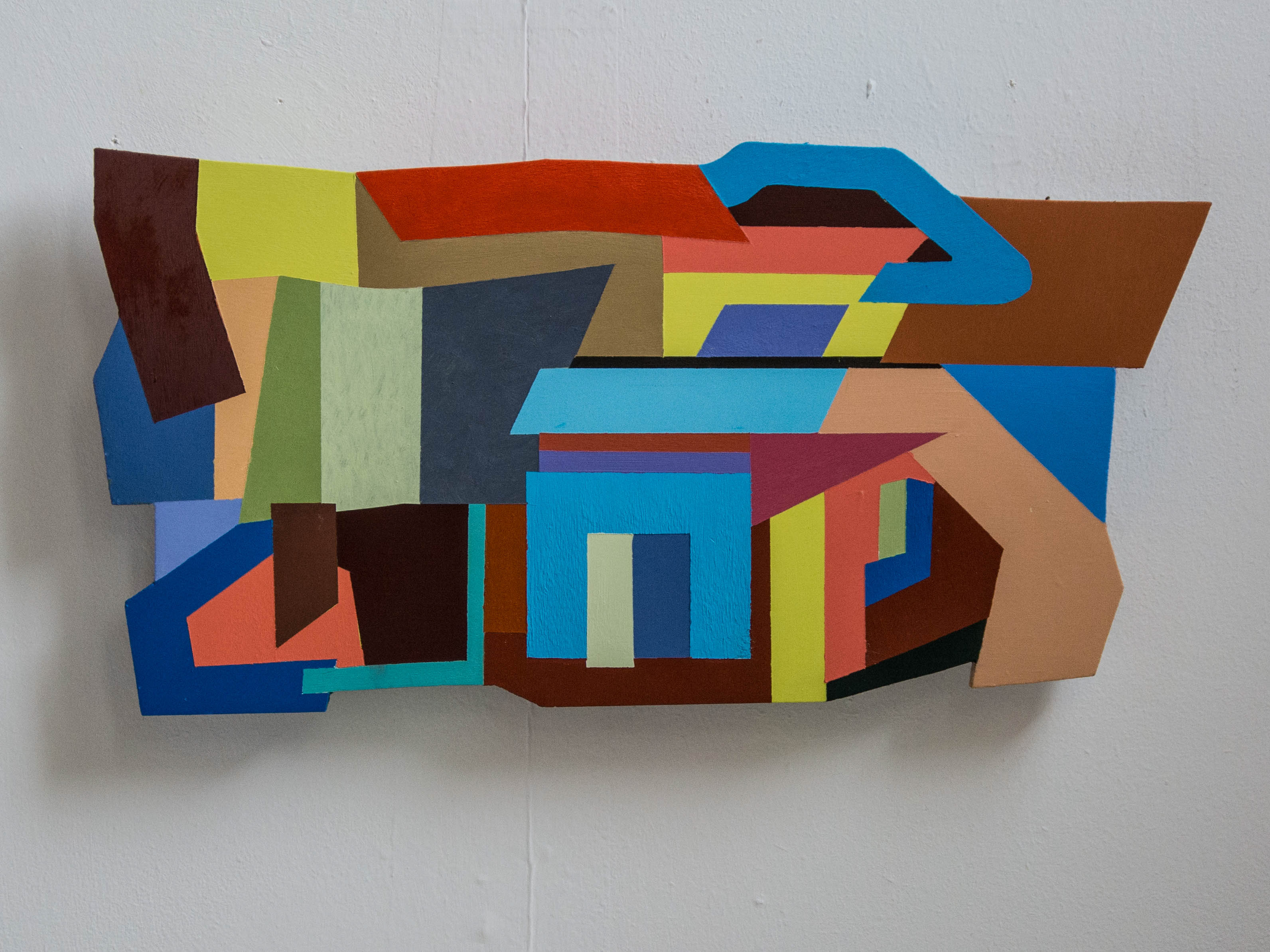
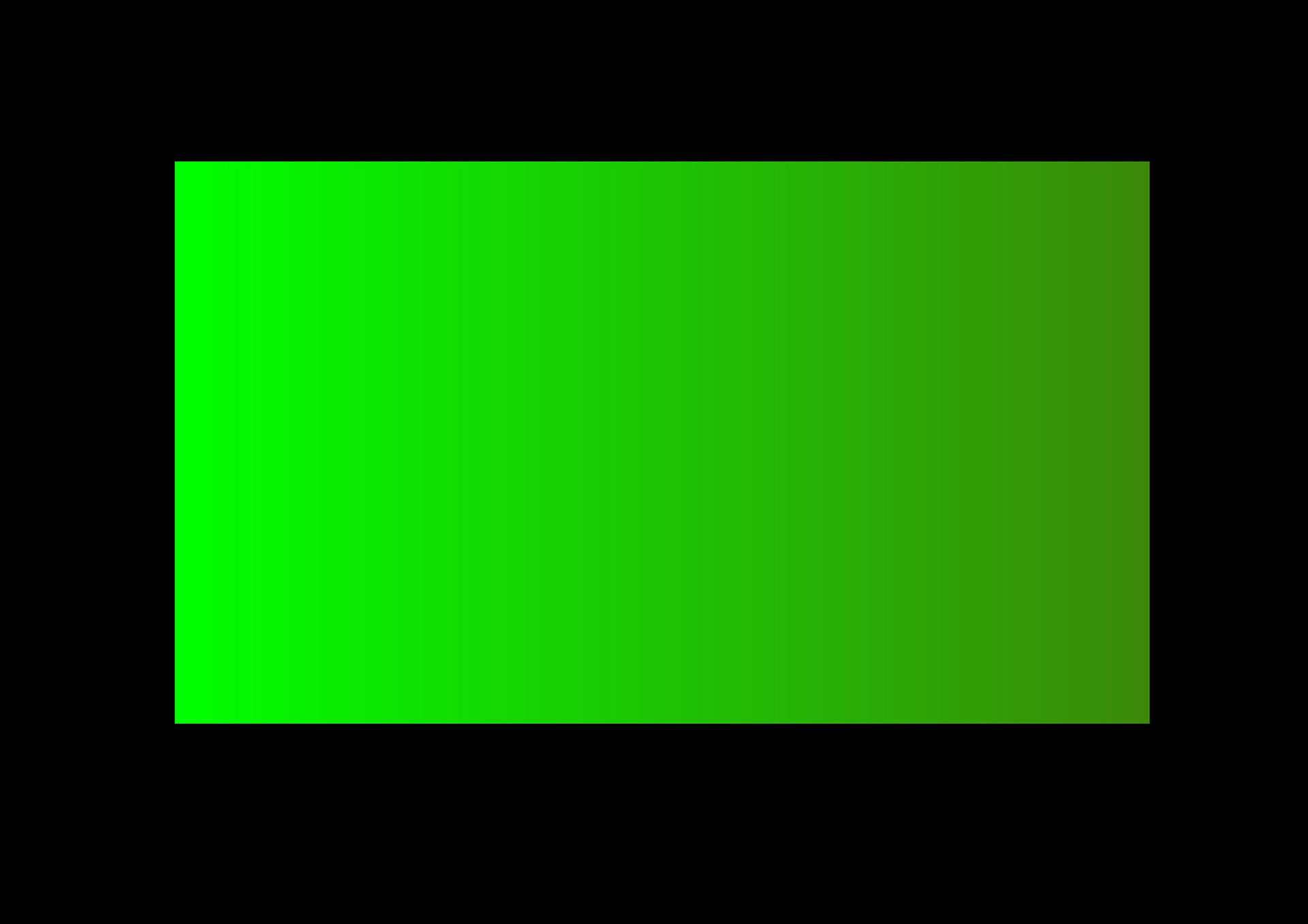
This film work explores additive colour. As a painter I use subtractive colour, that is colour that exists in a tangible form (pigment) and relates to our experience of the natural world in that colour defines a surface. There are only two additive colours in the natural world; the sky and the colour we see when our eyes are closed. All other colours are essentially subtractive and exist to define a surface. In the non natural world additive colour exists in projected light and screen.
In this work, I chose the black frame to focus on the image that is actually a non-image and creates an effect of simultaneous contrast – the colours that the eye is constantly searching for or creating in opposition to the actual colour. The simultaneous contrast is further explored by the bar and the horizons within the non image. The fusion points of one colour against another are, of course, pictorial and relate to my painting, but here the time based form creates multiple contrasts that further explore a changing interaction.
I am interested that we look at an image that is not an image and perhaps this is where the collaboration with sound is really possible. The chromatic event is autonomous and certainly to do with reality in so much that it takes place in time and space. In using this tool for making a film work I have begun to explore the uncertain elements of mixing additive colour; it is not to do with aesthetics or expression, but instead focuses on the unstable range of colour perception in the additive environment.
Stokes, Adrian: The Image in Form. Penguin 1972
Cruz Diez, Carlos: Reflection on Color. Fundación Juan March, 2009
Albers, Josef: Interaction of Colour. Yale 2006
Synchronicity II 3 by 5
15.02 minutes
Andrew Smith with Dimitri Rastoropov
This is the collaborative film work with composer Dimitri Rastoropov and has been presented for
ICAW 2014 documented art space.
I am very interested in the way the two art forms seem to have become mutually beneficial. Certainly with the film work bulding on Synchronicity (8 minutes), the extended time frames adds a new dimension to the experience of the colour areas. It is designed as an installation piece and is projected but it is also and in some respects, more effective on the screen. This is because the visual textures are evident and seem unfixed as if on each view the interval would be different. This quality is to do with film additive colour but is also digital.